

Range Calendar shows two months side by side, a column of relative presets, and the span between the two dates the reader picked. It does not hold that span: three of its props are required, and all three are handed down by the picker that owns the value.
Anatomy
Section titled “Anatomy”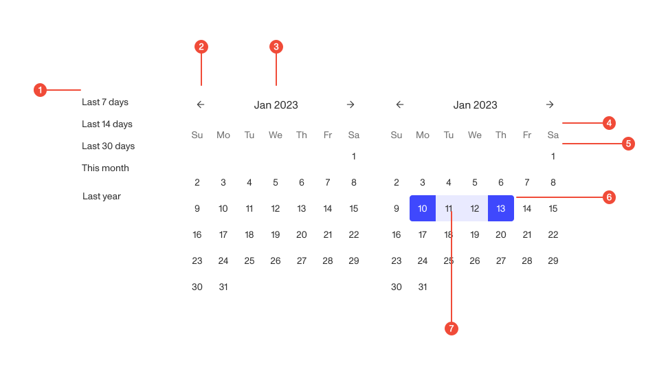
- 1 Preset (optional) one of seven relative ranges. The column is there unless hidePresets removes it.
- 2 Navigation controls previous and next month. The first grid carries the back arrow, the last carries the forward one.
- 3 Month and year label the month on show, formatted for the reader’s locale and hidden from screen readers.
- 4 Weekday label the days of the week, in the locale’s own starting order.
- 5 Day label one date, as a button.
- 6 Active date each end of the range, filled and rounded on its outer edge.
- 7 Highlight date every date between the two ends. Nobody pressed these; the component filled them in.
When to use
Section titled “When to use”The question here is a span rather than a date: the window an index table is filtered to, the period a report covers. One date is Calendar’s job.
Give Range Calendar to a picker
Section titled “Give Range Calendar to a picker”setDateMode, setValue and granularity are all required, and none of the
three is something you decide. setValue’s own description says where it comes
from: DateRangePicker’s setValue. Filling those in by hand makes the consumer
the thing that should have been wiring the component.
The surface that is genuinely yours is smaller than the table looks. minDate
and maxDate bound what the range can reach, so a span the data cannot answer
for is never selectable; hidePresets and visibleMonths set what is on show;
onSelectDate, onPresetSelect and selectedPreset are the hooks a parent uses
to take over. Everything else belongs to RangeCalendarBaseProps<DateValue>.
Selection
Section titled “Selection”Show the second month by default
Section titled “Show the second month by default”visibleMonths is 1 or 2 and defaults to 2. Drop it to one and a range that
crosses a month boundary needs navigation between the two clicks, with the first
end off screen while the reader chooses the second. Most ranges people ask for
cross a boundary.
React-aria pairs the two presses unless you take over
Section titled “React-aria pairs the two presses unless you take over”Selection runs through react-aria: the first press sets an anchor, the second
completes the range, and the dates in between are highlighted as the pointer
moves. onSelectDate takes that over instead of watching it: when you pass it,
each press calls your handler and then clears the anchor, so the component never
pairs two dates and never reaches setValue from a grid press at all.
Pass it only when the parent is tracking one end at a time, which is what
setDateMode is for: it reports start, end or null as the end under edit
changes.
Presets
Section titled “Presets”The seven presets are fixed
Section titled “The seven presets are fixed”They are last 7 days, last 14 days, last 30 days, this month, last month, this
year and last year. The preset list accepts a replacement function
internally and Range Calendar does not forward it, so there is no prop for
adding a preset, renaming one, or changing the order. hidePresets hides the
column, and that is the whole of the control you have over it.
Call commit, or a preset only fills the range
Section titled “Call commit, or a preset only fills the range”onPresetSelect receives the preset’s id and a commit callback. With no
handler, pressing a preset commits the range immediately. With a handler,
nothing is applied until commit runs, which is the hook for a parent that
needs to validate or record the choice first. Either way, setDateMode is
called with null afterwards, because a preset answers for both ends at once.
Which preset shows as current is separate. selectedPreset marks one
explicitly, null says none is selected, and leaving it undefined makes the
list infer it by matching the current value against each preset’s range on year,
month and day. First match wins, so overlapping presets never both light up.
A preset’s end is clamped to now, floored to the minute
Section titled “A preset’s end is clamped to now, floored to the minute”When granularity is finer than a day, a preset’s end is stretched to the last
millisecond of its final day and then clamped to now, floored to the minute. The
source gives both reasons: a filter rejects a bound in the future and drops the
range entirely, and flooring to the minute keeps the bound a stable value rather
than whatever sub-second time the press happened to land on.
Accessibility
Section titled “Accessibility”Reach the second month with the arrow keys
Section titled “Reach the second month with the arrow keys”Tab reaches the grids once. The second grid is taken out of the tab order deliberately, so crossing from one month into the next is an arrow key rather than a Tab, and the two months behave as one grid.
One hidden label names both months
Section titled “One hidden label names both months”Each month heading is aria-hidden, and the calendar’s own label is rendered
once in a visually hidden node above them. That label is your aria-label
followed by the visible month range, so the control announces itself once
instead of naming each month again. Pass an aria-label saying what the range
is for, because without one the calendar announces only which months are on
screen.
Content
Section titled “Content”Label the two ends
Section titled “Label the two ends”“Start date” and “End date”, on the fields the picker exposes. The grid does not say which end the next press will set, and once the first press has landed the highlight follows the pointer, so a range being drawn and a range that is finished look alike.
| Name | Type |
|---|---|
minDate |
|
maxDate |
|
calendarRef |
|
hidePresets |
|
visibleMonths |
|
onSelectDate |
|
setDateModerequired |
|
onPresetSelect |
|
selectedPreset |
|
setValuerequired |
From setValue of DateRangePicker |
granularityrequired |
|
RangeCalendarBaseProps<DateValue>.Was this page helpful?