

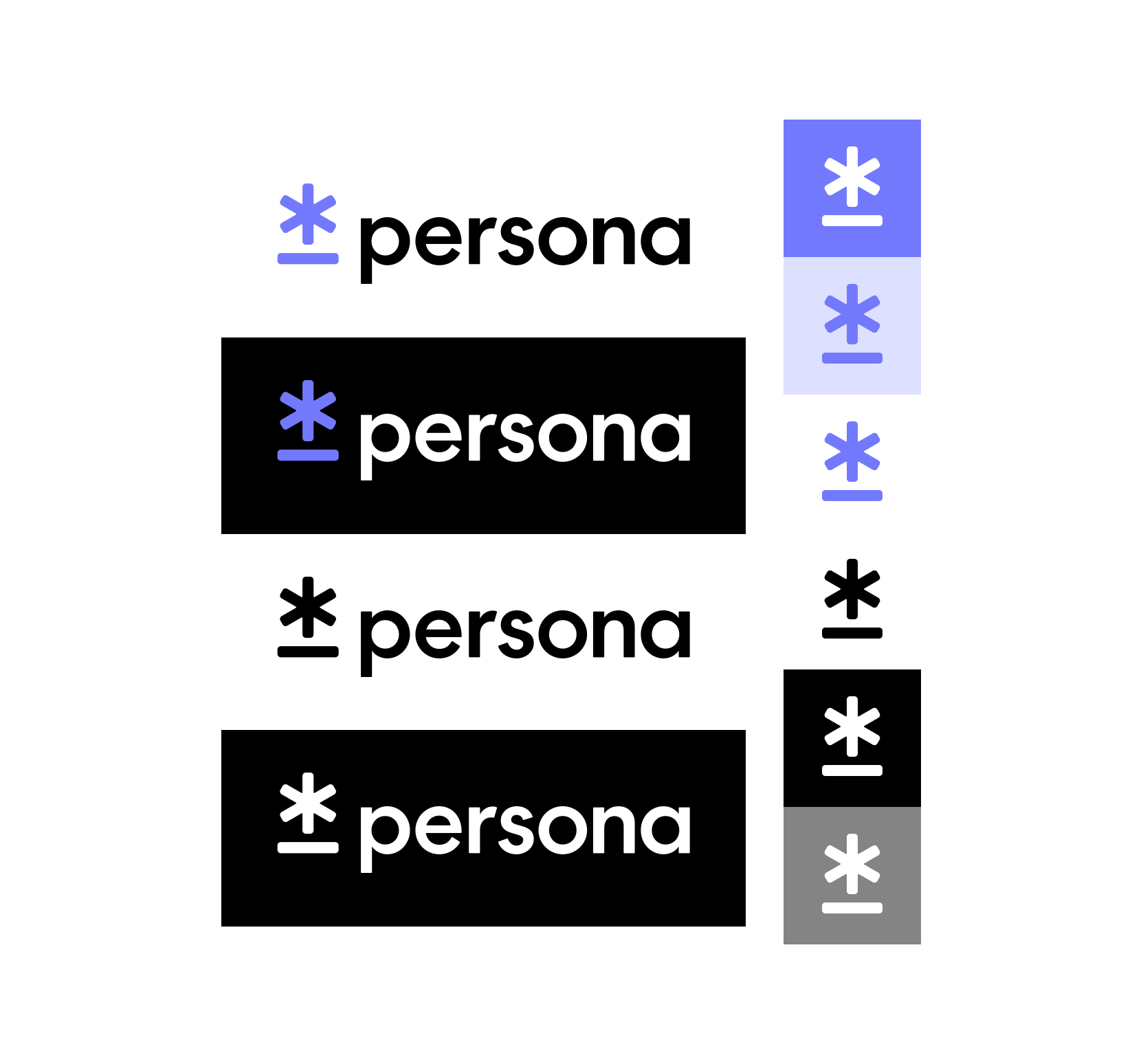
The Persona identity is a mark — an asterisk over a rule — and a lowercase logotype. The two together are the lockup, and the mark stands alone where the lockup will not fit.
The only Persona marks in code are two circled icons
Section titled “The only Persona marks in code are two circled icons”@persona/icons ships PersonaLogoIcon and PersonaIcon at 16px and 24px, and PersonaLogoIcon alone at 12px. Both draw their glyph inside a ring: PersonaLogoIcon is the asterisk mark circled, and PersonaIcon is a lowercase p circled. Neither is the lockup, and neither is the uncircled mark this sheet is showing you.
Both are also single-fill — fill="currentColor", like every other icon — so the duotone lockup, the purple mark against a black logotype, cannot be assembled from them at all. Any use of the identity as it is drawn above starts from the Figma file, not from a package. There is no code path to it.
The logo artwork is drawn in Purple 500, not the brand purple
Section titled “The logo artwork is drawn in Purple 500, not the brand purple”The purple drawn in the artwork above is #7379FD, read out of the SVG. The palette step that matches it is color.Core.Purple.500, which resolves to #7379FD. The token the system calls the brand purple is color.Primary.Purple — that is color.Core.Purple.600, or #3F48FD — a step darker.
Those two hex values are derived from the package on every build, so if the palette moves and the artwork does not, this paragraph will stop agreeing with itself in public.
Which of the two is correct for the identity is not recorded anywhere in this repo. Treat the Figma file as authoritative for the logo and the token as authoritative for the product, and do not derive one from the other until somebody reconciles them.
Clear space and minimum size are not specified anywhere
Section titled “Clear space and minimum size are not specified anywhere”Every brand guide has a clear-space ratio and a minimum legible size. This one does not have them written down — not in this repo, not in the token package, and not as a frame in the artwork above. Nothing in code enforces either.
The rules that usually sit under such a heading are therefore conventions here rather than specifications: do not alter the proportions, the orientation or the color; do not add a shadow, gradient or outline; do not crop or stretch it; do not combine it with other shapes to make a new mark. Each one is checkable only by a person looking at it. Color is the one worth naming twice, because currentColor makes recoloring the single alteration the code assets do without resistance.
WCAG exempts a logotype from its contrast minimum
Section titled “WCAG exempts a logotype from its contrast minimum”WCAG 1.4.3 excludes text that is part of a logo or brand name from its contrast minimum, so the 4.5:1 figure that applies to body text is not a requirement for the logotype. Do not cite it as one.
What remains is the judgment, and the artwork above has already made it six times: the mark is approved on purple 500, pale purple, white, black and mid grey, with a specific ink for each. Those six pairings are the answer to “which variant on this background”. A background not among them — a photograph, a gradient, a pattern — has no approved pairing, which is the reason not to use one rather than a contrast ratio you can argue about.
Describe the logo’s job in alt text, never its drawing
Section titled “Describe the logo’s job in alt text, never its drawing”A logo that links to the homepage is a link, and its accessible name is the destination: “Persona home”. A logo sitting beside a heading that already reads Persona is decoration, and its alt is empty so a screen reader skips it rather than saying the word twice. Those are the only two cases, and neither of them describes the artwork — nobody needs “asterisk mark in purple” read out, because the drawing is not what they are deciding about.
Was this page helpful?